Pages

  • Home
Facebook Instagram Twitter
Studio Kit

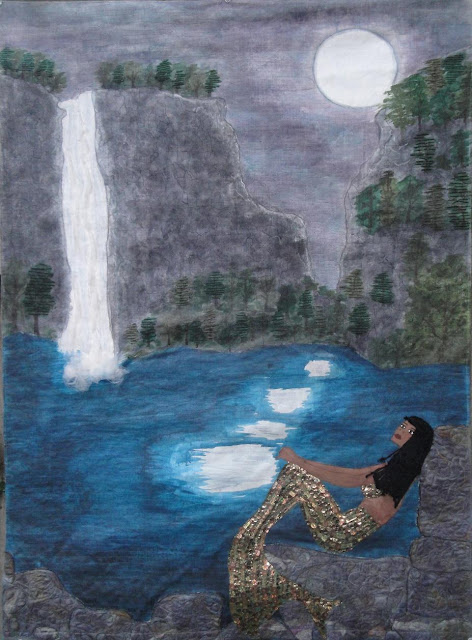
Now she really IS finished!

If you compare her with the last version, you can see the subtle improvements. 


First of all, as you can see, I did make not only her head, but her neck, shoulders and upper torso a little bigger - making her upper body much more proportionate with her tail.

I also darkened the water (again) - because I didn't want it to be quite so cyan blue - I wanted it to be more of a teal blue.  But when I did that, the original, darker (and more accurate!) skin colour of my mermaid didn't show up so well, so I needed to lighten her to provide a little more contrast with the water. 


Unfortunately, although i was VERY careful removing the mermaid's body from the piece in order to re-do her uppers, the beads became loose, so all my hand-stitching was for naught - I had to sew them all down by machine. Boo!

I also painted over the moonlight with a lavender wash and then a light blue wash, and added some grey-blue ripples, so the moonlight didn't read so unrealistically white. 


I also improved upon the rocks, as much as I loved them in their original incarnation, I felt they needed more depth and interest, which I created by adding painted highlights and lowlights - dropping a big, liquid dollop onto the spot and then rubbing it in with my finger.


I also made some subtle improvements to the waterfall, adding shades of blue, grey and lavender and added still another wash of black and then grey on the cliffs, to provide more contrast with the sky (compare with the original HERE.)

The improvements took more than a few hours, but I think the time's been well spent - I really do think she's noticeably improved!

So, she's all done. She has her sleeve, her label, even her bag - and is all ready to go the City Gallery Waterfront Park in Charleston, SC in August.

Did I tell you I'm going too?  I'll be there for the grand opening of the show on September 6 - if you're in the area, I'd love to meet you!

Photobucket
2
Share

This piece is a response to the ongoing efforts by the state to legislate women’s bodies.
As I read about the de-funding of Planned Parenthood, forced trans-vaginal examinations for women seeking certain services (including rape victims who wish to terminate a resulting pregnancy);  employers being given the power to decide whether or not a woman should use birth control, Sandra Fluke being called a “slut” by Rush Limbaugh for daring to claim her sexuality, and Lisa Brown's speaking privileges revoked for using the word "vagina"; this image formed in my head of a man, standing on a heaped pile of  naked women’s bodies, with a big ol' flag, saying "I claim this land in the name of..."


I thought about the names that women are called that infantilize us, demean us, shame us; words that cast women as unequal, inhuman or inanimate; words that reduce women to their sex, sexuality, or sex organs; and how these words are reinforced not only by socialization, the media and pop culture, but by the institutionalized enforcement of gender stereotypes.


I thought about how that legislation (current and under review), is being used to claim and commodify women’s bodies as “talking points” in politicians’ public debates; making our most private parts public, yet denying us the right to attempt re-claim them by dignifying them with their proper names.


I chose a “pin-up girl” to represent this commodified woman, crucified on their political platforms; and I stitched on her body the names of the two women who have most recently been egregiously, publicly reduced in the defence of women’s bodies and their right to have autonomy over them; along with some of the words used to describe us, that are impressed upon us like markings, like tattoos…
…all words that are Written On The Body.

Photobucket
36
Share

Saved this post for hump day...

I started with my usual (for the Whitewashed series, anyway) background of "bricks".  

I explained what the bricks meant quite some time ago - but for those of you who missed it, (I noticed my followers rate fluctuates up and down a lot!) - the bricks form a wall - each individual brick is metaphorically composed of the things that make the wall with respect to whatever each piece's topic is. 


The fabrics I use for those bricks has meaning - the first two pieces were red, white and blue - or at least were meant to read that way - to represent the "America Now" component of the two pieces. 

In this case, all of these floral fabrics and pastel "girly" colour have multi-layered meanings - foremost among them, gender stereotypes. 


And the whitewashing - done with a thinned out version of Golden Acrylic's Titanium White I(after a first layer of gesso) - is meant to represent the ways that we all conspire to ignore what's going on in front of us, either out of apathy, or hope that "someone else" will take care of the problem.

Finished piece on Friday - fair warning - it may push some buttons; but either way, I'm looking forward to seeing what your reactions will be!

Photobucket
12
Share

My next piece in the Whitewashed series is about what's happening in the US right now with respect to the legislation of womens' bodies.  It came about because The International Quilt Challenge's theme was "land/marks".

Because of the reading I had been doing with respect to the de-funding of Planned Parenthood; forced trans-vaginal examinations for women seeking certain services (including rape victims who wish to terminate a resulting pregnancy);  employers being given the power to decide whether or not a woman should use birth control, Lisa Brown's speaking privileges revoked for using the word "vagina", and on and on...


So, as soon as I saw the challenge, I had this image in my head of a man, standing on a pile of women's naked bodies, with a big ol' flag, saying "I claim this land in the name of..."

I wasn't going to do that exact image, but it's what inspired the piece as a whole. 

I knew that I needed a woman's body to represent all women - a woman who was the embodiment of iconic female sexuality- curvy, lush, sexually available. 

I started out with my lutradur background, and picked the above three colours for her initial skin colour.

Having learned from my mistakes I knew I needed to build up the colour, so once her base colour was dry, I added water and more red and yellow ochre to make washes to give her skin a lovely multi-toned effect. 


For part of the background, I also needed brown fabric in a certain colourway - and not having it in my stash, I turned to my needle felter and roving in the above shades - and laid 'em all out on an old chocolate brown pillowcase piece.


It looked like this before the actual needle felting, pinned and ready to go - you'll also note that I pulled some bits of thread out of my thread catcher to add to the mix. I hadn't done it before but assumed it would work out!


When it was felted, it looked like this - so I pulled some threads to stitch it all down.


And when I was done that it looked like this!  I didn't do a great job taking a picture of it, but this fabric is really luscious in person - soft, rich looking, delicious (even if I do say so myself!) and and a much darker brown.

Come back on Wednesday for the next instalment in the progress - and on Friday for the big finish! See you then!

Photobucket
6
Share

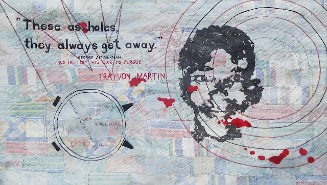
Almost forgot!!! If you live in or near Marion, IN, my piece America Now: Walking While Black, will be hanging in THE QUILTERS HALL OF FAME - for their Celebration 2012 event this weekend as part of the Fiber Artists for Hope exhibition
Photobucket
3
Share

All done!

So when I left you last, I had pieced together my red silk and the pieces of old silk kimono and had begun to apply my leftover bits of black fused fabric.


After I'd laid them all out, fused them down and quilted the piece, I began to think that I had named it incorrectly.  I mean, it was the flotsam from my "Walking While Black" attempts, and it was meeting the Japanese kimonos...


...but perhaps I should have called it "Creature Feature"!

There was something vaguely alligator-ish, something that looked a bit like an antelope...


... a fun monster-guy,


a horse, a snake, an eye (actually, there are two or three eyes in this piece)...


a werewolf-ish strongman type guy,


and of course, The Blob.

What was fun about finding these "people" is that they weren't cut on purpose - there they were, in the bits.

This piece has been very popular ever since I finished it.  BSP and my boys have been arguing over who gets to have it, and a co-worker wanted to buy it (but not at the price I was selling it).  And the Drunken Quilters loved it as well.

Hope you like it too!

See you on Monday with the beginnings of something new.

Photobucket

P.S. - Joining in with Thank Goodness It's Finished Friday.  Check out what other folks have been up to!
12
Share

Remember when I did a million experiments on how to make Trayon Martin's face?

Well, before Jennie told/taught me about Lutradur, I had tried cutting a pattern out of different fused black fabrics - and all of the off cuts made really interesting shapes. 

I have made a habit of saving all of my fused leftover bits - they usually come in handy - but in this particular case, the shapes were so interesting, I knew that if I put them on an equally interesting background, they could be an art piece in themselves. 


and hey, speaking of backgrounds - here it is. I combined all those bits with some red silk in preparation. 

Finished piece on Friday!

Photobucket
10
Share

Working to deadlines can be quite stressful, so sometimes it's nice to just take a break in the middle.

Last month at our Drunken Quilters' meeting, we were presented with another challenge* - choose whatever you like from a selection of bits of antique kimonos and go forth and create!


As soon as I saw the two pieces on the far left, I knew exactly what I wanted to do with the - so I pulled a few that would coordinate, and got to it.

(Don't worry, I don't actually use that old cutting mat for anything important - but I often have it under my plastic sheeting on my paint table. )

Hope you all had a great weekend - link up in the comments if you wanna show us what you've been up to!
Photobucket
*Okay, it wasn't actually a challenge - more, "Hey girls want some of this?" and we all partook. So IIIIIIIII decided that was a gauntlet being thrown down, so, uhm, anyway my nuttiness is all in a good cause.  The piece is done. :)
5
Share

Well, she's sort of finished. :)  She is finished, in that she has a backing, a hanging sleeve, and a label, but as I looked at these pics that I've posted, I can see that there's some tweaking that needs to happen.


I'll explain as I go along, but let's enjoy it for what it is right now, m'kay?  :)

This new and improved sky, you 've already seen, I am in fact, really pleased with that sky. I think it looks like night, I like the highlighting on the edges of the cliff of the moonlight, and I really like the colours in the sky. 


And off to the left you see the waterfall - got a little 3D effect with the fluffy stuff  and I like that a lot - but I think I need a little work on it to give it some more dimension. And I like the quilting on the rocks - if you click on that pic to see it bigger, you'll see it. 


I like the water too - my twice quilted water - I first did wavy swoopy lines, and then decided it needed some more definition so I did some straight line quilting.  but I think the moon's reflection is a little too white - I think a wash is in order there - but I don't know whether to make it sort of gray, sort of blue, or sort or lavender. I need to have a think on it, but it needs a little something. 


Similarly, I like the rocks, but I think there's a little bit of a flat effect happening. Not that it's "flat" in a 3 dimensional way  - I do like very much that these rocks bring the eye forward and help to show that the cliff rocks are in the *background* not the foreground - but I think they're just sitting there doing nothing you know?

Not that rocks *do* a lot, but they're not doing much for this piece.  Maybe the addition of some fuzzy moss - but not TOO fuzzy - perhaps a little moonlight glittering on the wet? That kind of thing.


And Ms. Mermaid.  Although I love her tail and body shape, I don't like her skin.  Despite the fact that I used 3 shades of coppery brown and added a little gold-mixed-with-burnt-sienna to give her a bit of a glow - it's still quite flat looking. 


The legends of the mermaid at Little Karoo talk about her 'rosy cheeks" and I've certainly got that down, and I love, love, LOVE her hair (made from braided embroidery floss and sewn down),  but her lips are too pink and her eyes seem to be looking in a different directions, and I think her head's too small!!! lol

So I need to re-do her face, too. 


But despite all those "complaints", I'm pretty happy with her. Just a few little tweaks and she'll be good to go.

I'm going to take a break from her for a little while though - she's not due until July 23 - and I need to step away for a bit.

Something new next week!

Photobucket
16
Share

So, remember when I said that I thought I was going to have to add some washes to make my night time scene less "early morning" and more "night"?  


Well, "Ta Dah!!!"  :)


I started out with blobs of blue, black and red to make a purple wash...


...which looked sort of an eggplant-y once it was all stirred up. Even when I added the water, it still looked very dark, but when I tested it on the side, it looked like... 


The bottom wash, which I figured was too dark. 

So I added some more water in increments of about a 1/4 of a cup, and got the second version (above it) and then again (the very top version) which was my target colour. 


After the first, wash, I had this. Better, but still not dark enough. 

So I added colour directly to my wash, first a little blob of navy blue, and then added two more washes with more additions of navy blue...


and then added more black to the mixture and did two or three washes of the black.  When I started getting into the navy blues and blacks, I was adding washes to the pond water as well, to darken it up.


And this was the end result.

No, right?  

The water looks great, and it's certainly dark enough, but there's hardly any differentiation between the sky and the rocks. 

So I got out those original teals, blue-y greens and purples I started with, darkened them up with the additions of a drop or two of black and a drop or two of Prussian blue...


And that's what I ended up with.  Much better, no?


So, if you look at where it started, you can see that it's a big difference, and it doesn't look like morning or an overcast day anymore. Now, it actually looks like night. Yay!


You can see the progress side by side here (that pic is clickable if you want to look at it in a bigger size) - those four pictures represent 15-20 washes in total!

I'm totally in the home stretch now, I have probably only two or at the most three hours left on the piece. Phew!

Come on back on Friday for the big finish!

Photobucket
P.S. - It's Wednesday, so I'm linking up with the Needle And Thread Network - please check out what other Canadian fiber bloggers are up to!
15
Share
Newer Posts Older Posts Home
Follow

Followers

Subscribe To

Posts
Atom
Posts
All Comments
Atom
All Comments

Find me on Facebook

Kit Lang Art

Promote Your Page Too

Find my work here

Find my work here

.

.

Member of:

Member of:

Popular Posts

  • Incendiary: Marie-Joseph Angelique
    (All pics are clickable for a bigger view) When I left you on Monday , Angélique and Claude had flown, and behind them, the city...
  • Hiraeth
    "Hiraeth"39" x 29" In the late fall of 2012, there was a call for a challenge group I don't belong to - "...
  • The 411, news and information post. :)
    Catch up time!! First of all, as promised, I'll tell you about the meaning behind each of the elements that were part of my Travyvon M...
  • Winter Is Coming
    My little transfer paint piece is complete. I've been reading Game of Thrones and my head is filled with images of that magical realis...
  • My Sewing Room, let me show you it!
    Well, good morning everyone - and welcome to my sewing room!  I'm so glad you decided to come for the tour! :) As you walk in to my...
  • Surprise Giveaway (to all of us! lol)
    Okay, to start with the good stuff... Here's what I'm giving away! No special hoops - if you want it - leave a comment - the...
  • Friday Finish and ANOTHER Giveaway!
    Golden Headed Blackbird (c) 2013 Kit Lang So, first things first: - here's my finished bird - a golden headed blackbird - and che...
  • America Now - Walking While Black
    In the black community in Canada and the US, when certain events happen to our brothers, our fathers, ourselves, we say "Oh ... DWB....
  • Blog Hop - Giveaway!
    COMMENTS CLOSED - Thanks everyone! It's a Saturday post and you know what that means... a surprise giveaway! I'm participating ...
  • Fairy Wren
    All done! Okay, I need to paint in that little stretch on the hem and I also need to paint the sides of the mounting board, but otherwi...

Labels

Angelique aquarelles argh Art Art 2009 Art 2010 Art 2011 Art 2012 Art 2012 Will work for Fire Art 2013 Art 2014 Art 2019 Art 2025 bead embroidery beading behind the green curtain bird series Bloggers Quilt Festival blogging break Bremen babies Briar Rose challenges Charley Harper collage and mixed media commissions completely terrifying things contemporary embroidery discharge disperse dye doh drawing class dum de dum eco dyeing encaustic ephemera er...oops ethereal exhibitions and shows experiments and play fabric dyeing fairy tales fern series festivals n' events First quilt foil For the birds Friday Link Post Friday' S-Linky Post from the discard file Fugitive Media Fun stuff Generation Q Magazine gifts hand -painted fabric hand painted fabric hand painted paper hand work handwork horn tootin' I'm a lucky girl illustration in progress in progress inspiration kit is talky Kit Lang learning Lunchtime project Mermaid Mixed Media mixed media art monoprint needle felting New blog new to me news nqr ONN other sewing paint lutradur and pellon painted lutradur painted lutradur and pellon painted paper painted papers painted quilt painted work paper work paperwork pellon stabilizer and lutradur political pretty stuff process Project Kit PSA Quilts Quilts 2008 Quilts 2009 Quilts 2010 Quilts 2011 Quilts 2012 rust dyed fabric S-A-T-U-R-D-A-Y-DAY SAQA saved me from myself SeeMe Gallery Sewing room shirt piece sketches small pieces Stolen art studio Taking Flight textile painting the 100 day project 2025 the gentle arts the journeymen quilts the process behind the process the100dayproject2025 thread painting totally cute things transfer paint and/or disperse dye Trayvon Martin tree series watercolor watercolor printing watercolour Week Link Post what next? whitewashed Will work for Fire Winging Away wip woman at work working with disposables works in progress world watercolor month 2016 Year In Review
Copyright © 2016 Studio Kit

Created By ThemeXpose | Distributed By Blogger Templates20