So when I left you last, I had pieced together my red silk and the pieces of old silk kimono and had begun to apply my leftover bits of black fused fabric.
After I'd laid them all out, fused them down and quilted the piece, I began to think that I had named it incorrectly. I mean, it was the flotsam from my "Walking While Black" attempts, and it was meeting the Japanese kimonos...
...but perhaps I should have called it "Creature Feature"!
There was something vaguely alligator-ish, something that looked a bit like an antelope...
... a fun monster-guy,
a horse, a snake, an eye (actually, there are two or three eyes in this piece)...
a werewolf-ish strongman type guy,
and of course, The Blob.
What was fun about finding these "people" is that they weren't cut on purpose - there they were, in the bits.
This piece has been very popular ever since I finished it. BSP and my boys have been arguing over who gets to have it, and a co-worker wanted to buy it (but not at the price I was selling it). And the Drunken Quilters loved it as well.
Hope you like it too!
See you on Monday with the beginnings of something new.
P.S. - Joining in with Thank Goodness It's Finished Friday. Check out what other folks have been up to!
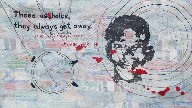
Remember when I did a million experiments on how to make Trayon Martin's face?
Well, before Jennie told/taught me about Lutradur, I had tried cutting a pattern out of different fused black fabrics - and all of the off cuts made really interesting shapes.
I have made a habit of saving all of my fused leftover bits - they usually come in handy - but in this particular case, the shapes were so interesting, I knew that if I put them on an equally interesting background, they could be an art piece in themselves.
and hey, speaking of backgrounds - here it is. I combined all those bits with some red silk in preparation.
Finished piece on Friday!
Working to deadlines can be quite stressful, so sometimes it's nice to just take a break in the middle.
Last month at our Drunken Quilters' meeting, we were presented with another challenge* - choose whatever you like from a selection of bits of antique kimonos and go forth and create!
As soon as I saw the two pieces on the far left, I knew exactly what I wanted to do with the - so I pulled a few that would coordinate, and got to it.
(Don't worry, I don't actually use that old cutting mat for anything important - but I often have it under my plastic sheeting on my paint table. )
Hope you all had a great weekend - link up in the comments if you wanna show us what you've been up to!
*Okay, it wasn't actually a challenge - more, "Hey girls want some of this?" and we all partook. So IIIIIIIII decided that was a gauntlet being thrown down, so, uhm, anyway my nuttiness is all in a good cause. The piece is done. :)
Well, she's sort of finished. :) She is finished, in that she has a backing, a hanging sleeve, and a label, but as I looked at these pics that I've posted, I can see that there's some tweaking that needs to happen.
I'll explain as I go along, but let's enjoy it for what it is right now, m'kay? :)
This new and improved sky, you 've already seen, I am in fact, really pleased with that sky. I think it looks like night, I like the highlighting on the edges of the cliff of the moonlight, and I really like the colours in the sky.
And off to the left you see the waterfall - got a little 3D effect with the fluffy stuff and I like that a lot - but I think I need a little work on it to give it some more dimension. And I like the quilting on the rocks - if you click on that pic to see it bigger, you'll see it.
I like the water too - my twice quilted water - I first did wavy swoopy lines, and then decided it needed some more definition so I did some straight line quilting. but I think the moon's reflection is a little too white - I think a wash is in order there - but I don't know whether to make it sort of gray, sort of blue, or sort or lavender. I need to have a think on it, but it needs a little something.
Similarly, I like the rocks, but I think there's a little bit of a flat effect happening. Not that it's "flat" in a 3 dimensional way - I do like very much that these rocks bring the eye forward and help to show that the cliff rocks are in the *background* not the foreground - but I think they're just sitting there doing nothing you know?
Not that rocks *do* a lot, but they're not doing much for this piece. Maybe the addition of some fuzzy moss - but not TOO fuzzy - perhaps a little moonlight glittering on the wet? That kind of thing.
And Ms. Mermaid. Although I love her tail and body shape, I don't like her skin. Despite the fact that I used 3 shades of coppery brown and added a little gold-mixed-with-burnt-sienna to give her a bit of a glow - it's still quite flat looking.
The legends of the mermaid at Little Karoo talk about her 'rosy cheeks" and I've certainly got that down, and I love, love, LOVE her hair (made from braided embroidery floss and sewn down), but her lips are too pink and her eyes seem to be looking in a different directions, and I think her head's too small!!! lol
So I need to re-do her face, too.
So I need to re-do her face, too.
But despite all those "complaints", I'm pretty happy with her. Just a few little tweaks and she'll be good to go.
I'm going to take a break from her for a little while though - she's not due until July 23 - and I need to step away for a bit.
Something new next week!
So, remember when I said that I thought I was going to have to add some washes to make my night time scene less "early morning" and more "night"?
Well, "Ta Dah!!!" :)
I started out with blobs of blue, black and red to make a purple wash...
...which looked sort of an eggplant-y once it was all stirred up. Even when I added the water, it still looked very dark, but when I tested it on the side, it looked like...
The bottom wash, which I figured was too dark.
So I added some more water in increments of about a 1/4 of a cup, and got the second version (above it) and then again (the very top version) which was my target colour.
After the first, wash, I had this. Better, but still not dark enough.
So I added colour directly to my wash, first a little blob of navy blue, and then added two more washes with more additions of navy blue...
and then added more black to the mixture and did two or three washes of the black. When I started getting into the navy blues and blacks, I was adding washes to the pond water as well, to darken it up.
And this was the end result.
No, right?
The water looks great, and it's certainly dark enough, but there's hardly any differentiation between the sky and the rocks.
So I got out those original teals, blue-y greens and purples I started with, darkened them up with the additions of a drop or two of black and a drop or two of Prussian blue...
And that's what I ended up with. Much better, no?
So, if you look at where it started, you can see that it's a big difference, and it doesn't look like morning or an overcast day anymore. Now, it actually looks like night. Yay!

You can see the progress side by side here (that pic is clickable if you want to look at it in a bigger size) - those four pictures represent 15-20 washes in total!
I'm totally in the home stretch now, I have probably only two or at the most three hours left on the piece. Phew!
Come on back on Friday for the big finish!
P.S. - It's Wednesday, so I'm linking up with the Needle And Thread Network - please check out what other Canadian fiber bloggers are up to!
Followers
Find me on Facebook
Find my work here

.

Member of:


+2012+Kit+Lang.JPG)


+2012+Kit+Lang+(inside).jpg)


.jpg)


