A successful conclusion!
To those of you who have joined me recently - this saga began several months ago (posts are here, here, here, here, here, here and here - I TOLD you it was a saga! *w*) and I simply had to make this piece if only to finally have closure. lol
The piece is based on the very last "scene" from the Grimm fairy tale, "The Musicians of Bremen", a fairy tale I enjoyed very much as a child - likely for its themes of justice and redemption. :)
The piece as a whole is 8 x 10 inches so each of these animals is wee - the Donkey being the biggest at a grandiose 1 inch tall. Each individual piece of each animal is made of a piece of fused fabric...
As are their instruments, the stones in the path,
and the leaves on the trees.
I'm really pleased to have this done and some day I'm going to re-visit it - by illustrating the rest of the story!
But in the meantime, I've got other irons in the fire - stay tuned for the beginnings of new work on Monday.
Have a great weekend!
Anybody NOT from Eastern Canada familiar with "begin'igin"? (It means, "begin, again".) ;)
So, remember my whole resin gone wrong experiment?
Well, I'm not trying it again - at least, not yet! *w* But I AM re-making that Bremen piece which was the subject of that debacle!
So, I started with the same silk floral as the background fabric - I had just enough to piece together a background (!) and then I commenced to cutting out my house, my one billion teeny tiny leaves and my trees.
As you can see, it does look at bit different than the original - but this time I free-hand cut with the old in front of me, rather than drawing patterns on the paper back of the fused material and cutting them out that way (I can't shake the thought somehow that it's damaging my scissors to do that!)
And I'm including this old photo just for fun.

NEVER FORGET.
lol
Finished piece on Friday!
P.S. - and it's Wednesday, so THAT means WIP Wednesday at The Needle And Thread Network
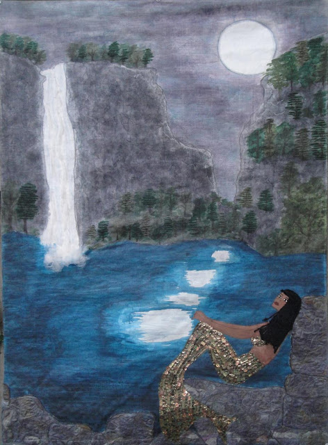
Now she really IS finished!
If you compare her with the last version, you can see the subtle improvements.
First of all, as you can see, I did make not only her head, but her neck, shoulders and upper torso a little bigger - making her upper body much more proportionate with her tail.
I also darkened the water (again) - because I didn't want it to be quite so cyan blue - I wanted it to be more of a teal blue. But when I did that, the original, darker (and more accurate!) skin colour of my mermaid didn't show up so well, so I needed to lighten her to provide a little more contrast with the water.
Unfortunately, although i was VERY careful removing the mermaid's body from the piece in order to re-do her uppers, the beads became loose, so all my hand-stitching was for naught - I had to sew them all down by machine. Boo!
I also painted over the moonlight with a lavender wash and then a light blue wash, and added some grey-blue ripples, so the moonlight didn't read so unrealistically white.
I also improved upon the rocks, as much as I loved them in their original incarnation, I felt they needed more depth and interest, which I created by adding painted highlights and lowlights - dropping a big, liquid dollop onto the spot and then rubbing it in with my finger.
I also made some subtle improvements to the waterfall, adding shades of blue, grey and lavender and added still another wash of black and then grey on the cliffs, to provide more contrast with the sky (compare with the original HERE.)
The improvements took more than a few hours, but I think the time's been well spent - I really do think she's noticeably improved!
So, she's all done. She has her sleeve, her label, even her bag - and is all ready to go the City Gallery Waterfront Park in Charleston, SC in August.
Did I tell you I'm going too? I'll be there for the grand opening of the show on September 6 - if you're in the area, I'd love to meet you!
As I read about the de-funding of Planned Parenthood, forced trans-vaginal examinations for women seeking certain services (including rape victims who wish to terminate a resulting pregnancy); employers being given the power to decide whether or not a woman should use birth control, Sandra Fluke being called a “slut” by Rush Limbaugh for daring to claim her sexuality, and Lisa Brown's speaking privileges revoked for using the word "vagina"; this image formed in my head of a man, standing on a heaped pile of naked women’s bodies, with a big ol' flag, saying "I claim this land in the name of..."
I thought about the names that women are called that infantilize us, demean us, shame us; words that cast women as unequal, inhuman or inanimate; words that reduce women to their sex, sexuality, or sex organs; and how these words are reinforced not only by socialization, the media and pop culture, but by the institutionalized enforcement of gender stereotypes.
I thought about how that legislation (current and under review), is being used to claim and commodify women’s bodies as “talking points” in politicians’ public debates; making our most private parts public, yet denying us the right to attempt re-claim them by dignifying them with their proper names.
I chose a “pin-up girl” to represent this commodified woman, crucified on their political platforms; and I stitched on her body the names of the two women who have most recently been egregiously, publicly reduced in the defence of women’s bodies and their right to have autonomy over them; along with some of the words used to describe us, that are impressed upon us like markings, like tattoos…
…all words that are Written On The Body.
Saved this post for hump day...
I started with my usual (for the Whitewashed series, anyway) background of "bricks".
I explained what the bricks meant quite some time ago - but for those of you who missed it, (I noticed my followers rate fluctuates up and down a lot!) - the bricks form a wall - each individual brick is metaphorically composed of the things that make the wall with respect to whatever each piece's topic is.
The fabrics I use for those bricks has meaning - the first two pieces were red, white and blue - or at least were meant to read that way - to represent the "America Now" component of the two pieces.
In this case, all of these floral fabrics and pastel "girly" colour have multi-layered meanings - foremost among them, gender stereotypes.
And the whitewashing - done with a thinned out version of Golden Acrylic's Titanium White I(after a first layer of gesso) - is meant to represent the ways that we all conspire to ignore what's going on in front of us, either out of apathy, or hope that "someone else" will take care of the problem.
Finished piece on Friday - fair warning - it may push some buttons; but either way, I'm looking forward to seeing what your reactions will be!
Followers
Find me on Facebook
Find my work here

.

Member of:


+2012++Kit+Lang+(this+one).JPG)
+2012+Kit+Lang(2).jpg)


.jpg)

+2012+Kit+Lang.jpg)

+Little+Karoo+At+Night+(c)+2012+Kit+Lang.jpg)
+2012+Kit+Lang.jpg)
+2012+Kit+Lang.jpg)
+2012+Kit+Lang.jpg)
+2013+Kit+Lang.jpg)
+2012+Kit+Lang.jpg)
+2012+Kit+Lang.jpg)
.jpg)
.jpg)
.jpg)


